MUST READ ART BLOGS
An Essential Guide: Interior Design Themes for the Hallway
An entryway not only provides steps to the essential part of your home but is also a key source of inspiration when it comes to the decoration of your home. A formal foyer is a defining factor of the first impression for your home and a dramatic entryway leaves the guest beguiled and with a lasting impression.
It is not to be forgotten! This is where most interior designers face obstacles, conflicting between either under-or over-embellishment. Another crucial aspect to remember is that embellishment does not only entail matching furniture, décor, and rugs but also creating a wow factor through statement pieces.
So, greet the guests in style by mixing interesting décor with “wow-factor” artworks, be it a statement piece or small-framed photographs. Take a look at the following information when it comes to decorating your entryways.
SET THE STAGE
An entryway can be an excellent way of showcasing your personal style that captures the essence of the rest of the home as a preview. So, set the stage for anyone who walks through the front door with a full-story statement piece that immediately catches the attention of the eye. In fact, a foyer is one of the best places to place a large and oversized artwork. With this approach, you would definitely be able to offer your guests a grand entrance! Check out our designs that can form eye-catching pieces for your home.
Curator's choice: On The Walk by Sandra
Try out our new AR feature with your phone to see how this painting from Sandra is going to look on your walls at home and office!
A MIX OF PATTERN AND PLAY
Play on the patterns and colors of your space and use your creativity to find a perfect fit between the palette and shapes. Embrace this technique with an open mind and find a piece that best matches your personal style while exploring geometric shapes, lines, and curves. Due to the first impression, an entryway can make the ideal place to express your personality and style. If you are someone who likes to keep their place decluttered with a less-is-more style, match the essence of the rest of your room while investing in a minimalistic approach when it comes to artworks. Invest in a few intricate details instead of cluttering the space with 5 different pieces and other accents. Take a look at our minimalistic collection of artworks!
LET THE COLOR POP!
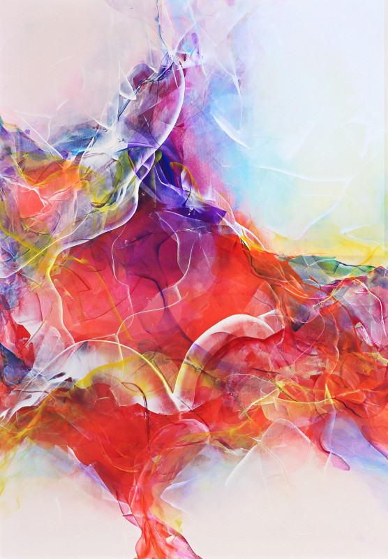
Enliven your hallway with splashes of colors and a play on different palettes. Choose pops of colors, such as red, orange, and blue, that complement the background elements of your home. Drawing inspiration from your favorite colors, accent the furniture, décor, rugs, and lighting. Looking for a rather oceanic artwork?
Curator's choice: Unbridled by Katerina
Read more about colors here!
WARM WELCOME
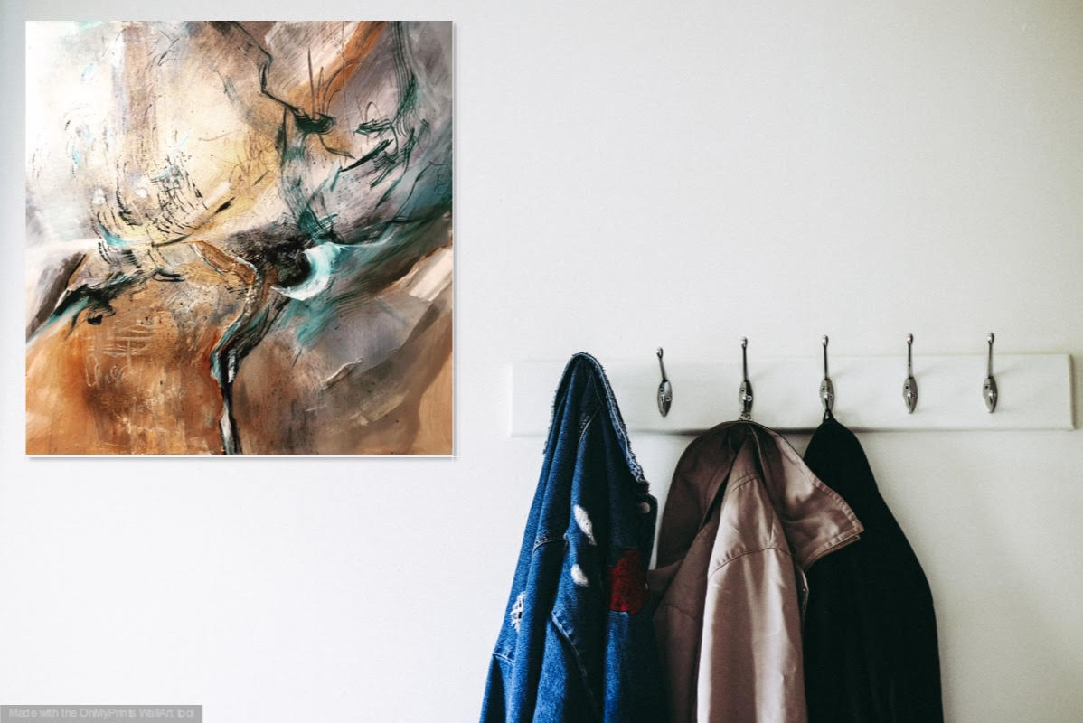
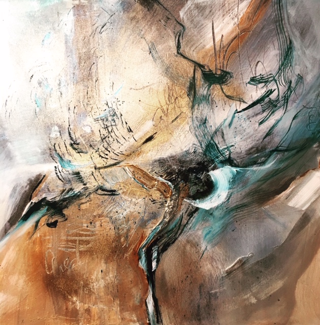
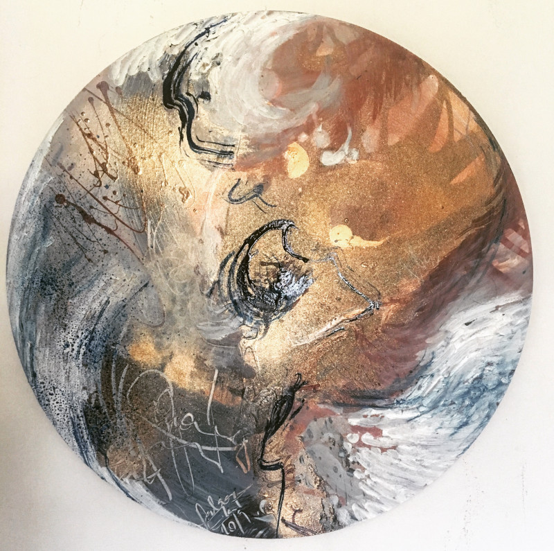
If you are not looking for stand-out pieces of artwork, consider inviting in your guests with a warm and inviting welcome. The best way to achieve this is with a neutral palette such as beige, ivory, taupe, black, gray, and shades of white. Fabricate and discover your personal style with our collection of neutral artworks, such as the talented work of In The Storm by our artist, Andrea.
Curator's choice: In The Storm by Andrea
GALLERY WALL
Invest in a wider collection of aesthetically similar artworks for the blank space in your home. Decorate your hallway by placing assorted sizes of individual artworks together while creating a gallery wall illusion. This helps with achieving an added depth and making the artworks come together with a unified outlook.
BE UNPREDICTABLE, BE UNCONVENTIONAL
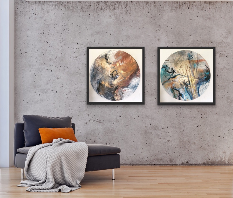
Explore a modern style of artworks. Step outside the ordinary and invest in a circular or diamond rather than a conventionally rectangular artwork. Victory Art possesses a varied collection of unconventional paintings, such as Flying Feathers by Andrea. You can also achieve uniqueness by adding personality with unexpected artworks.
Curator's choice: Flying Feathers II by Andrea
PASTEL ELEGANCE
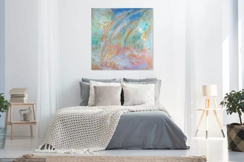
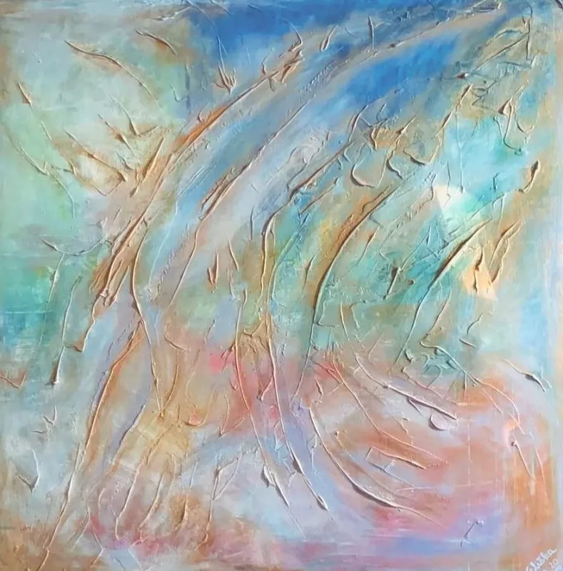
As explored in the Interior Design Trends for Summer 2019, the pastel trend is said to materialize as the new neutral this summer. Interior designers have predicted and noticed the ‘70s look of pastel-hued colors to have made a comeback with a softer, brighter, and toned-down look. This trend is accelerating in both the interior design and fashion industry this year! The pastel color of unique milky ice cream offers a more confident representation of plain white.
Curator's choice: Pastel Way by Eliška
Still not sure what types of design you want? No worries, take your time and take our interior design quiz to find out what suits your concept of space more! You can also check out our full art collection here! If you want to talk to us about specific requests or have questions about our art services, feel free to book an appointment with us!
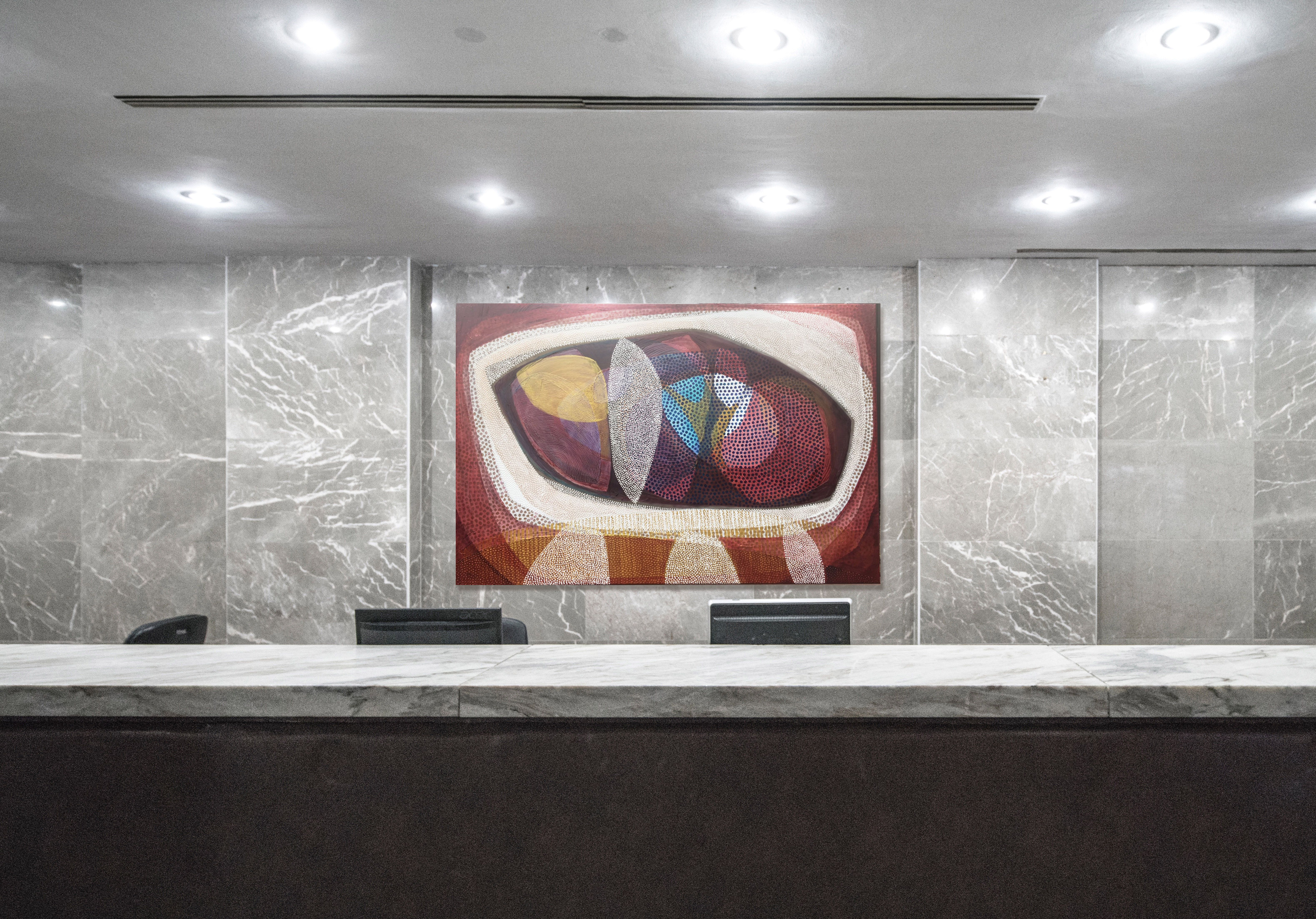
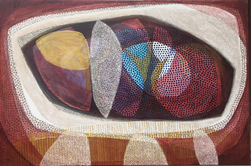
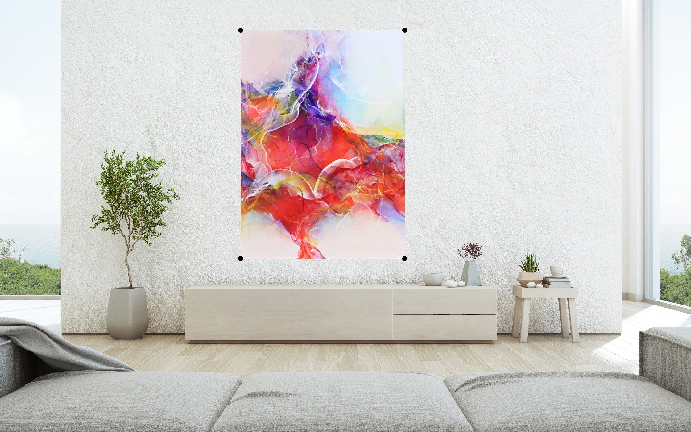
Which painting would be more suitable for giving your guests a warm welcome?
Scratch to find out!
|
|
|
|---|
CHECK OUT OUR BEST BLOGS

.webp)

.webp)
.webp)
.webp)
.webp)
.webp)


.jpg)